Kahvibaari
A digitalised brand and multi-lingual website for Finland's oldest standing coffee bar.
Services
UI, UX, Branding, WordPress Build
Platforms
Desktop, Mobile, Web
Deliverables
UI, UX, Brand Identity
About the client
Situated locally in Kannus since 1952, Kahvibaari is under new ownership as of 2020. They offer coffee, alcohol and live music.
Website UI & UX
Brief
The small town of Kannus has been home to its very own vintage coffee bar, running continuously since 1952.
The owners Tero and Annakreeta kindly asked me to produce a multi-lingual single-page website for the bar, to attract a new audience to the bar. The website had to work effectively across desktop and mobile, have a modern feel and have a multi-lingual feature to switch between Finnish and English languages.
Kannus has been my home since 2018, so it was a joy to contribute and to become a small part of the venue’s history.
Visit website
How did I have impact?
Working with the unique inner surroundings of the bar, I took inspiration from the authentic textures within. By photographing features in person to capture the flooring and the feel of the venue, I was able to produce a full website which truly feels part of the identity of the bar. Designing the site first, I was able to meet with the owners on numerous ocassions to talk through content and aims. Following feedback I built the site with Elementor for WordPress, including a multi-lingual feature which duplicated site content for personalised viewing.
The only brand in place for the venue is situated outside upon aged signage and had never been created digitally. I re-draw the typographic forms from a photograph and produced a digital logomark from the exact colours and forms found there today.
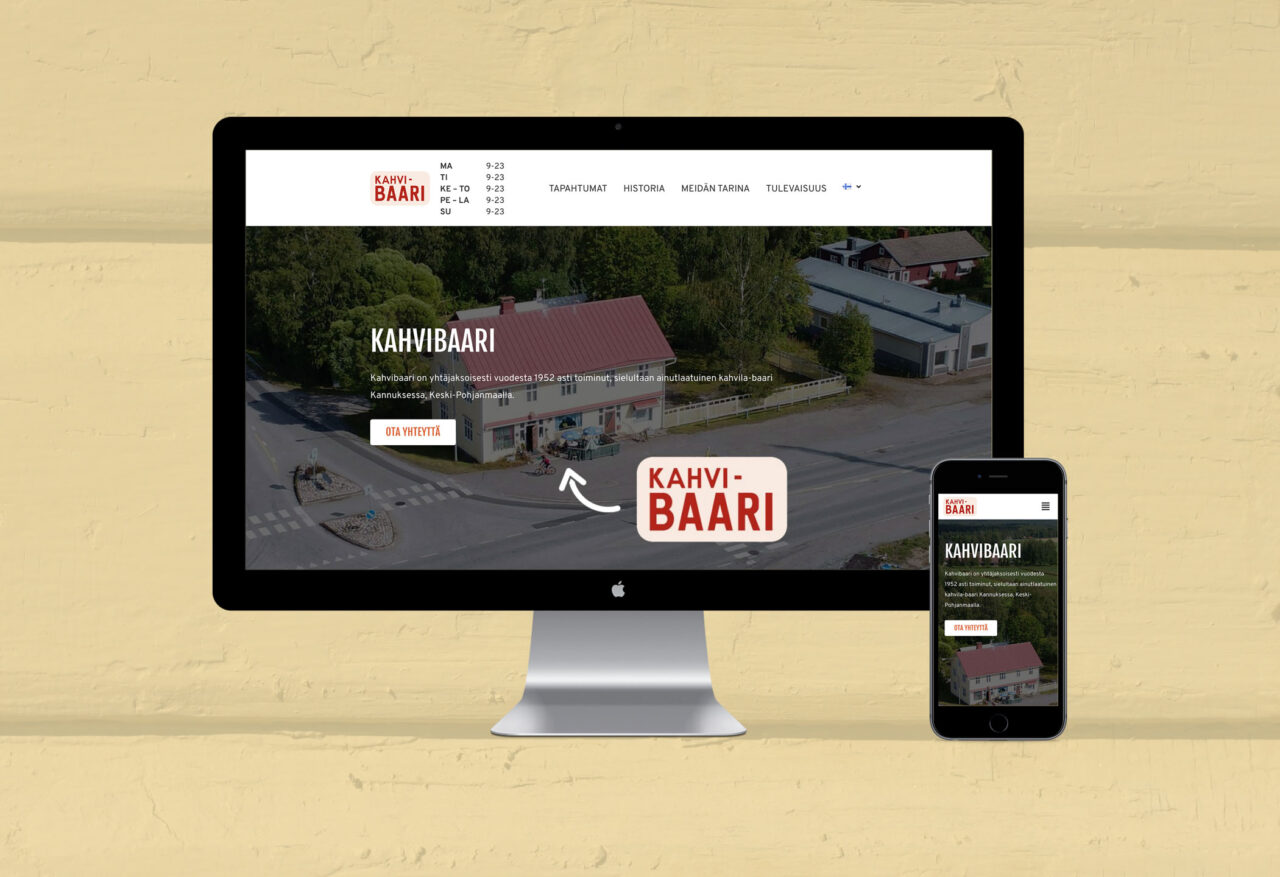
A single page website
From meeting with the client initially, it was clear that the history of the venue had to take pride of place in the website. They’d prepared a narrative for the page which helped us collaboratively establish a page flow. During this process I suggested having their Events further up the page than initially discussed in order to make these more prominent for customers.
From applying the rounded logomark, this helped establish the look and feel of the UI components including CTAs and imagery. The typography reflected similar forms to the logomark type, but as this was customised we used a Google Font equivalent.
Areas such as “play these floors” and “find and contact” use authentic imagery taken by me at the bar itself (not final in this artwork but on live site). This texture helps bring the bar’s unique features directly to the customer. Overall colours are taken directly from the bar’s interior such as the deep green and orange chairs, and the pale yellows taken from the wooden facade.
It was also key to include a live Instagram feed to highlight their activity online. With imagery and promotions almost daily from the bar, this is a strong base to connect with their audience.

A responsive Elementor solution
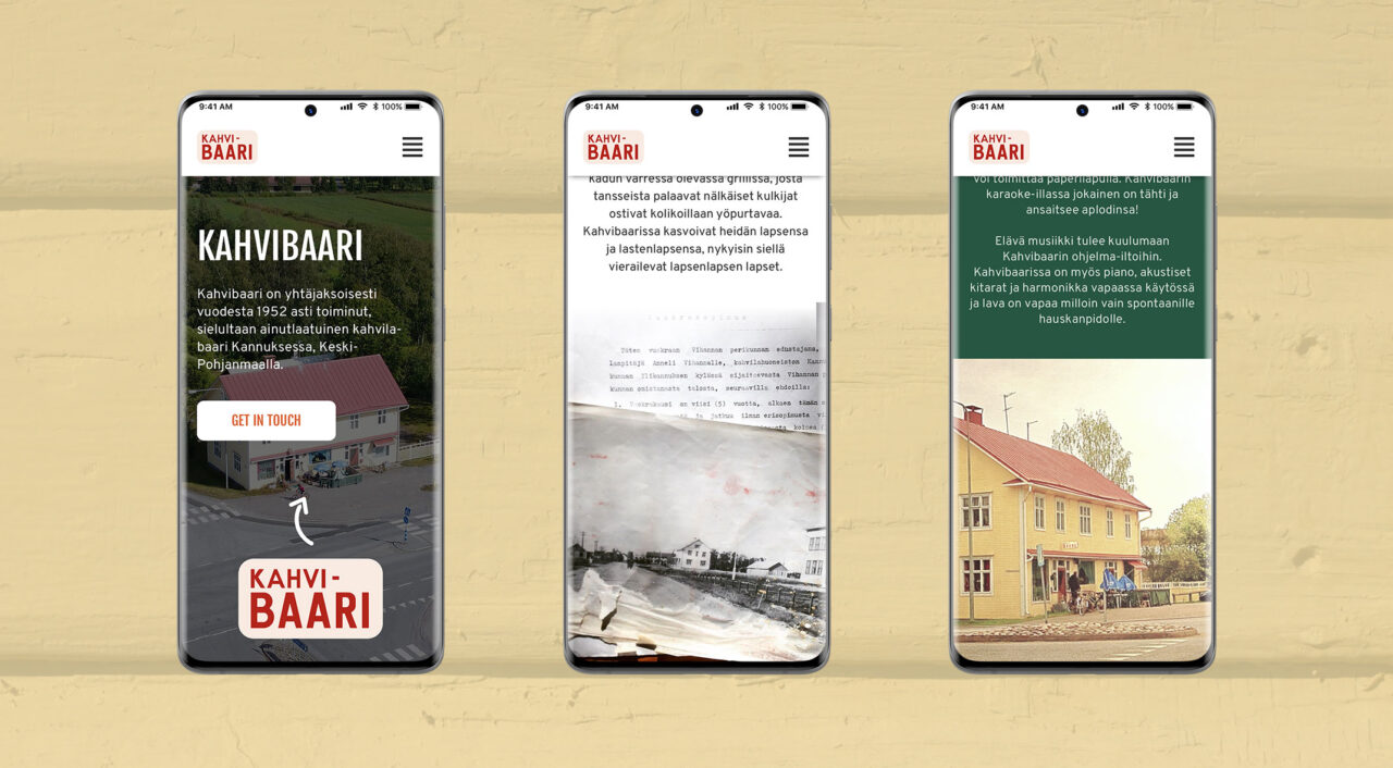
Taking the website design from Sketch, I solely built the page within Elementor for WordPress. By using Elementor this allowed me to work outside of the restraints of a common WordPress theme which works within a pre-defined structure. I was able to re-create the page design in Elementor without any coding.
The multi-lingual feature of the website was the most challenging from the project as this was my first duo-language build. Using Polylang for WordPress, this duplicated the existing content I’d created and enabled me to enter the correct translation into each section without any issues. The toggle in the original design had to be scrapped due to the plugin restraints, however a dropdown solution within the navigation worked effectively with the client extremely happy with the result.
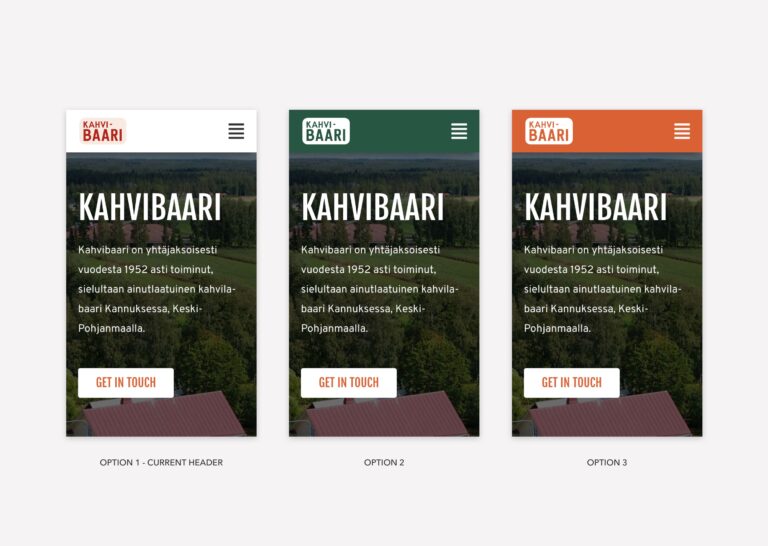
Design options
As the branding had been fully formed for the first time ever digitally, the client wanted to see how the header would look with the primary and secondary colour palettes used.
I provided 3 options; one which uses the normal colour logo on a white background, a green background with white-out logo and menu icon, and an orange version with white-out logo and white menu icon.
Although colourful and vibrant, the client chose the white version which utilises the full colour logo to stay true to the venue. The white-out version was therefore only used within the footer area.
Brand Identity
Brief
Alongside the website I also wanted to bring their physical signage (which went up in the 1960s) into the digital world. This self-initiated brief enabled me to photograph the existing signage and re-draw the characters in Adobe Illustrator.
The aim was to have a fully developed logo for use across the website and promotional materials.
How did I have impact?
The wordmark re-draw meant that I could kern the existing characters to become tighter than they are in the existing signage, but keep the existing typographic forms. The notable component from the wordmark is the scaling of “Baari” compared to the “Kahvi.”
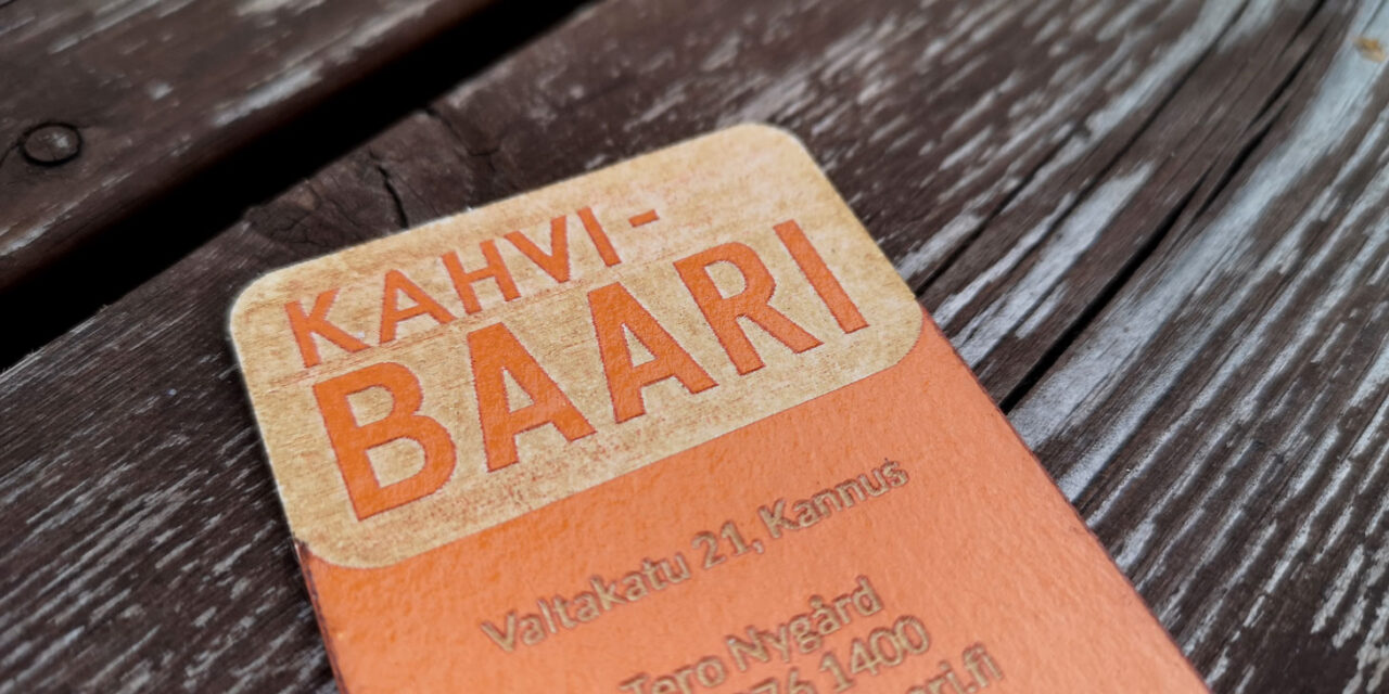
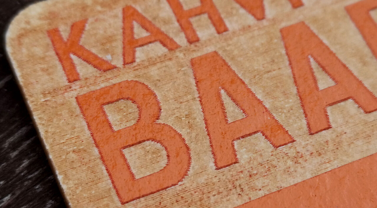
Now having the wordmark available digitally, this enabled the client to create their own business cards with this included (shown below). The authentic orange and cardboard combination created by Jonna Kurikkala adds to the unique look and feel the bar promotes.
I’ve also included the original bar signage photograph and the wordmark taken from said photograph. The final logo design by me has now been applied across the website and promotional material.


Special thanks/credits to:
Tero Nygård (Owner) & Annakreeta Salmela (Owner) – Thank you for trusting me.
Noora Kangas (Translator)
Jonna Kurikkala (Business card creator and engraver)
