Moken
Modern website with promotional materials for remote digital design agency Moken.
Services
UI, UX, Branding, Print Design
Platforms
Desktop, Mobile, Web
Deliverables
UI, UX, Interaction Design
About the client
Worked with the agency for 4 years as Lead UI/UX designer, up until June 2020.
Website UI & UX
Brief
Launching with a website in 2017, Moken Design needed a public-facing website to promote our working culture (remote working), expertise in digital design and conversion, and impress from a visual design standpoint. As lead UI/UX designer for the agency, I was tasked to create the majority of the website pages (between external client work), with iterations and refreshes up until the end of 2019.
How did I have impact?
I designed specific pages for the design agency website including the homepage, individual case studies, services and menu systems. The process meant working alongside the Director to establish the scope of the project and the business needs. This project saw myself, the Director and our lead developer collaborate to create a modern and interactive solution for leading remote design agency Moken.

A public-facing homepage
With new work ready to showcase, I was tasked with the new homepage design for the agency. There was an existing splash page design previous to this stage which was designed by Barry Woodhall. Barry tasked me to help expand into a full homepage with the help of Eugene, another UI designer on the team.
With a dynamic gradient held within the hero area, I inserted trust logos from our distinctive clients. We were also featured in Net magazine, which was advertised high up the page for recognition.
The hero case study was added underneath the hero in a full width design, animated in development to increase interactivity. This helped anchor our 50/50 grid which showcased multiple case study previews. The modules were spaced down the full length of the page, with the option to show more. Upon click, further case studies transitioned into view. This was beautifully animated by Rob Vilcu, the agency’s developer.
An automated testimonial area was introduced below the case study previews, with insight into our wireframe design at the bottom designed by Eugene. I also designed a dynamic clock footer which allowed us to view our client’s time zones.

Showcasing agency work
Multiple dynamic case study pages for the main website, linked from both the Homepage and the Project pages. The aim for the screens were to present key process points to showcase the arrival to the project solution.
Each case study kept the same structure visually with the colourful on-brand hero area with the logo and description of the project, working its way through the UX (if required) and UI stages.
Having this linear process allowed us to present each step in a visually engaging execution and slightly different for each project based upon deliverables. By adding a key call to action at the bottom of each case study allowed visitors to reach out, meanwhile they could continue browsing via the “next case study” section underneath.


“Stuart is an exceptional UI/UX designer that has lead across many briefs and sectors during his time at Moken. I was able to fully trust his guidance and design judgment for all projects that came through the agency door with confidence that he’d make a success of the project. Stuart is also a great client-facing asset to have on a team, he conducts himself professionally on calls and communicates client goals and expectations back to the team accurately. Stuart has been a pleasure to work with and I hope to continue the relationship with him as much as possible moving forward.”

Website navigation
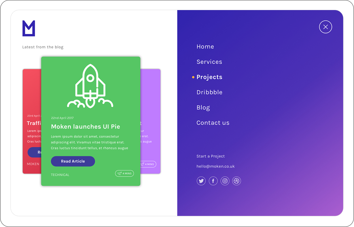
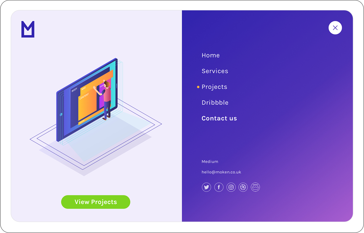
Designing a full-width menu system for desktop which would allow easy navigation to key pages.
The top two designs show how we could promote blog articles on the left, whilst the right screens shows a more condensed navigation and a selected state.
The bottom designs apply an illustrative focus on the left hand side, with the final set of links on the right. The final design ended up using the bottom left.
Illustrations by Bogdan Zhukov.


Agency blog
Part of the website design process involved looking at a blog for the agency to help with SEO. Although a blog was never built into the site, the designs featured were prepared for the site as a whole.
Using a scrolling sidebar on the left, the blog would focus on a category based navigation with a carousel within the main content.
Users can email an article to themselves to read later via an interaction design on the time-to-read info.
The article design contains a simple and clean layout. The hero area could potentially work as an animated banner, article dependant. I’ve also added a “you may also like” area underneath the main content to showcase articles under the same category. A consistent newsletter subscription bar has been added across both screens.


Services
Showcasing the agency’s services was a crucial part of the public-facing website. With a full service digital skillset we were able to commission a set of icons to present each service consistently.
As a team we wanted to also demonstrate our values, which sat in the middle of the page with the mantra. Lastly we showcased a black and white set of client logos to help increase trust in those whom employed our services.
The ‘Hi’ ellipse would follow the user upon scroll and link to a contact form. This would help push conversion leads during the browsing process.
Icon design by Ira Derenskaya.

Promotional design for print
Brief
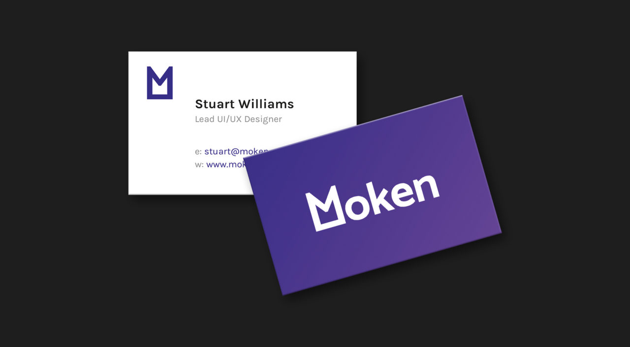
I was tasked from an early stage in the company to produce promotional material such as business cards. The cards needed to strongly reflect the brand identity whilst maintaining a clear hierarchy of information for the contact details.
How did I have impact?
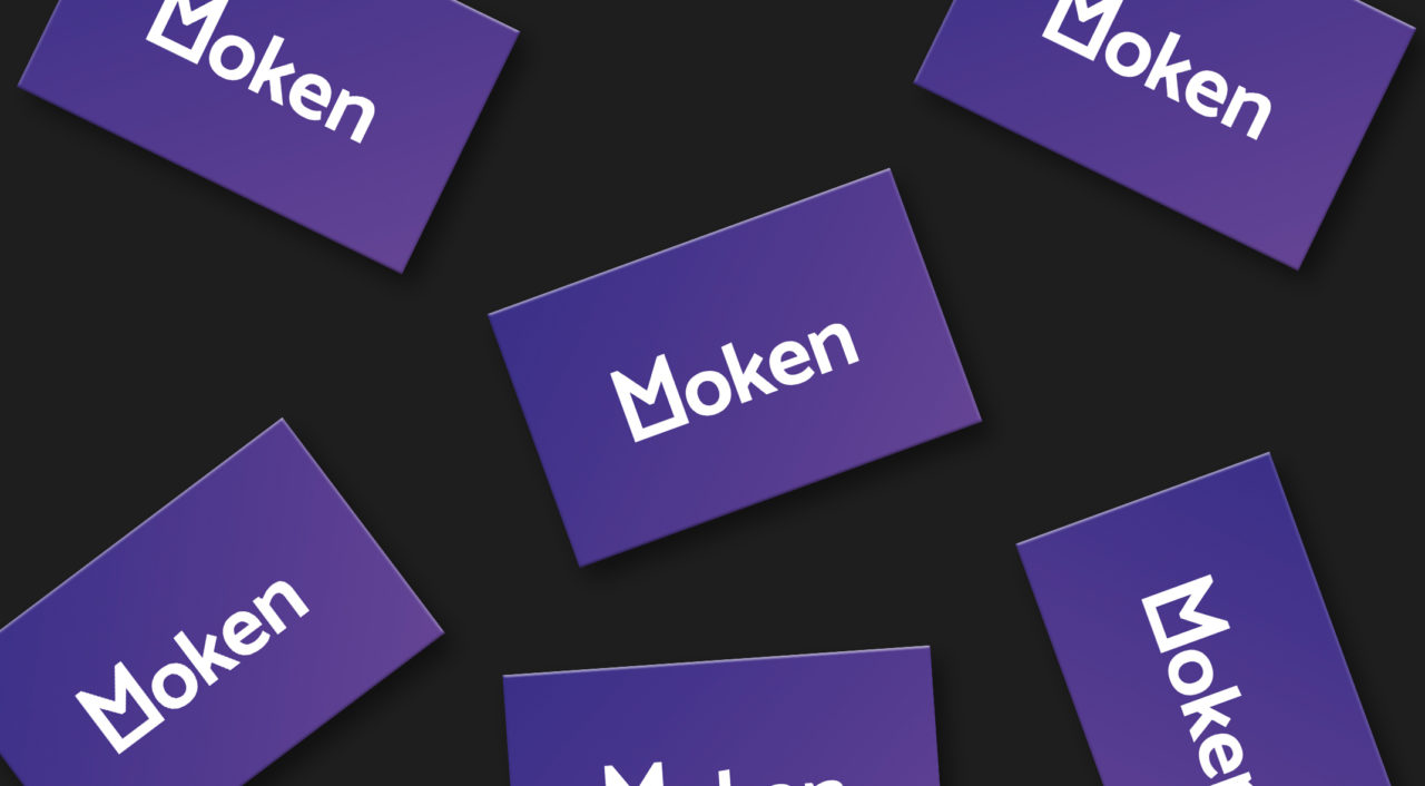
The business cards designed by me internally for the company allowed key team members to visit networking events and promote the agency. These were handed out at OFFF Barcelona in 2018, and at other festivals and events.
As the identity was primarily applied on the web, I was also tasked with converting the brand colour palette to CMYK for print. This meant consulting pantone swatches to ensure the conversion was an exact match across channels.
Printed by Moo on 300gsm card with purple edge-printing, this meant a high quality finish was applied to the cards.


Special thanks/credits to:
Barry Woodhall (Director) – UI design of initial splash page, and designed the Moken brand.
Eugene MT (UI designer) – UI design for wireframing section on Homepage.
Bogdan Zhukov (UI designer) – Illustrations for the menu system UI.
Ira Derenskaya (Illustrator) – Service icon designs featured on the case study designs and services page.
