Daisy Chain
Services: Branding, Print Design
BRIEF
A refreshed brand identity for floral designers Daisy Chain, based in Middlesex, UK.
Daisy Chain approached Stu-dio Design to help devise a new brand identity for their business, which works to elevate their luxury, hand-crafted service. The client provided me with their old brand, which looked outdated and less uniform.
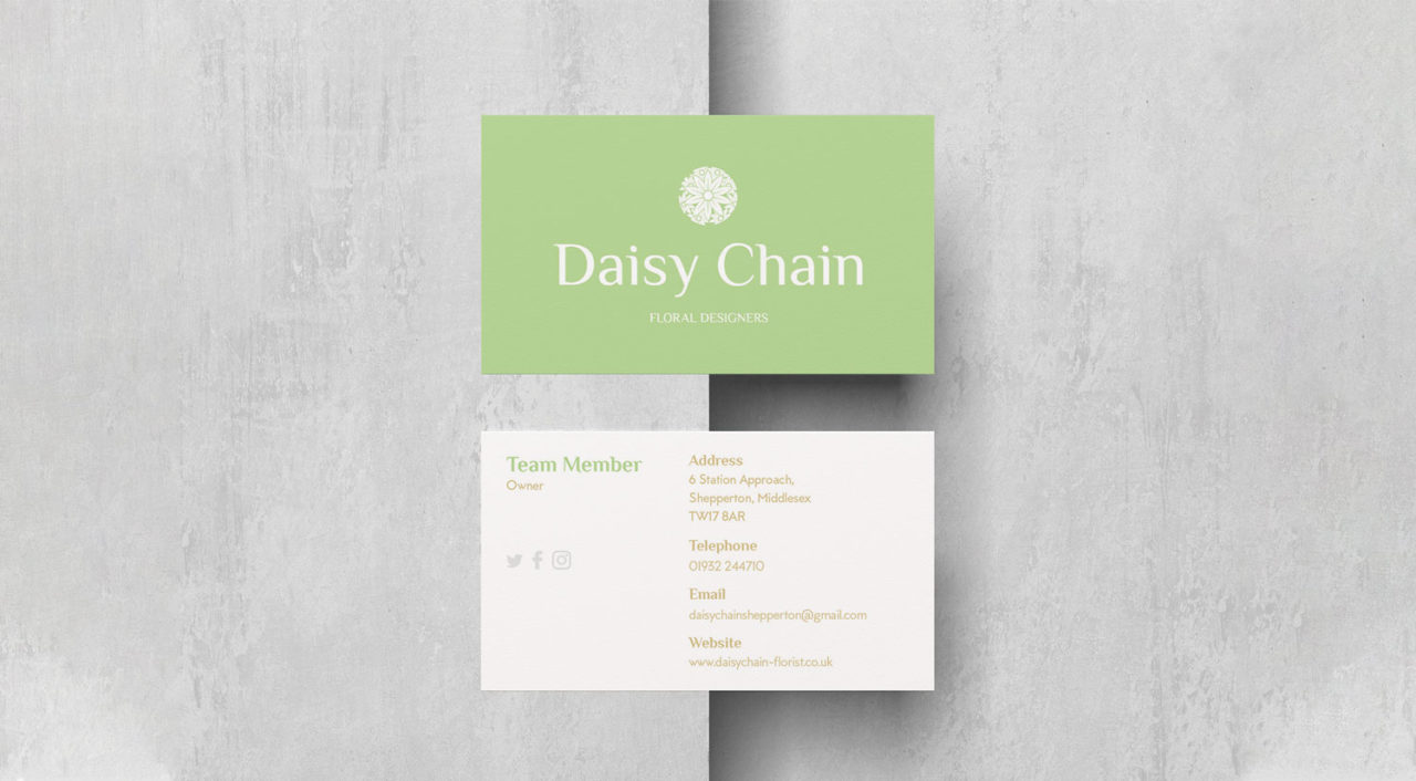
Daisy Chain also briefed me with creating business card and letterhead designs for use internally.
APPROACH
The client sent across examples of the look and feel they were looking for based on clear iconography. Using a stylistic icon approach will help identify the brand and unify their luxury message when paired with strong typography.
In-keeping with the luxury brand value, I’ve used a simple grid system on the print collateral to allow for the typography to breathe and work within the new colour palette.
HOW DID I HAVE IMPACT?
1) Following discussing multiple options for iconography and typography, the client approved the below final logo design. Using a combination of a circular motif and modern, stylish typography, the logomark took form.
2) The client also wanted to enforce their messaging ‘Floral Designers’ within the main logo lock-up, which I’ve applied a secondary, light gold brand colour.
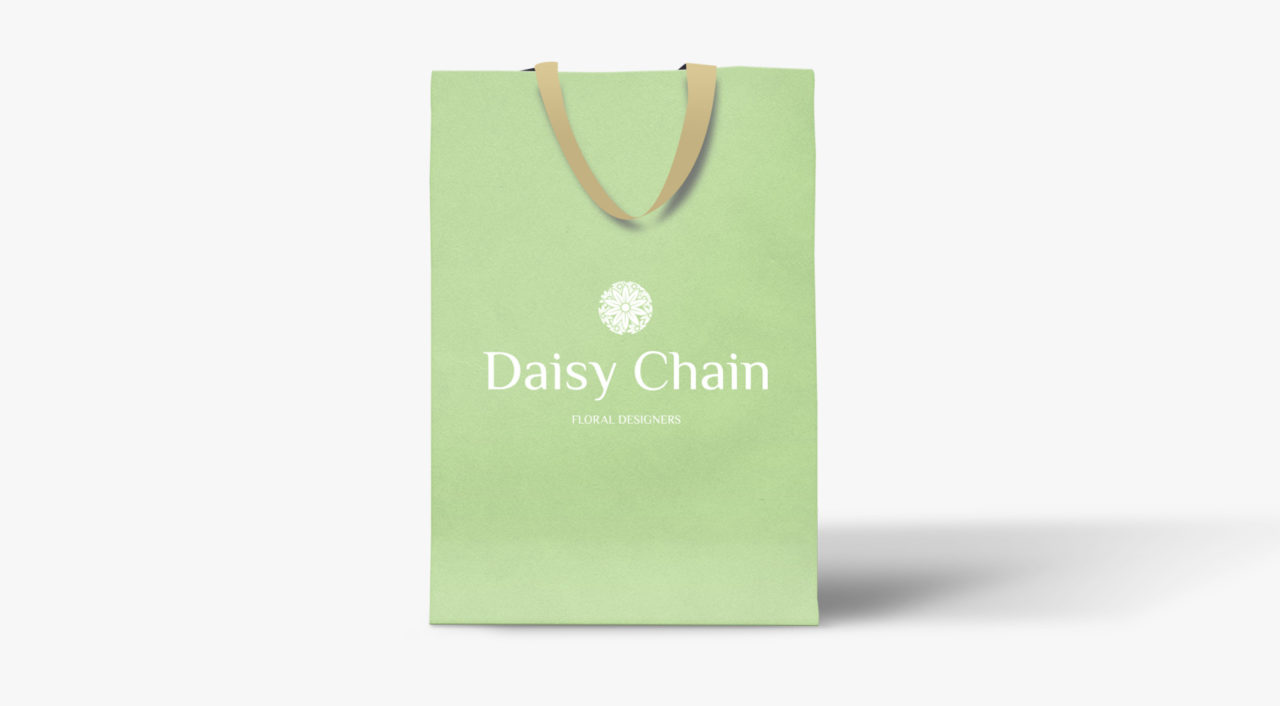
3) The client also asked to see the new colour palette applied to a package design, for in-shop purposes. The light gold handles and primary brand green have been applied, with a white version of the logo sitting centrally to the package.


